


A successful business website should be easy for everyone to access, understand, and use. Visitors may browse using different devices, assistive technologies, and input methods. Some people may have visual, hearing, mobility, or cognitive disabilities that affect how they interact with digital content. If a website is difficult to navigate or understand, these visitors may struggle to access important information or complete essential actions.
This is why Website Accessibility is an important part of modern website design and development. An accessible website helps visitors navigate pages, read information, interact with forms, understand images, and use digital services with fewer barriers.
As businesses prepare their websites for 2027, accessibility should be considered throughout the design, development, content creation, and maintenance process. Following recognized accessibility guidelines, improving mobile experiences, using readable typography, and testing with assistive technologies can make a meaningful difference.
The Web Content Accessibility Guidelines (WCAG) provide an internationally recognized framework for improving digital accessibility. WCAG 2.2 is an established W3C Recommendation, while WCAG 3.0 remains a working draft. Businesses should use established requirements and relevant legal guidance rather than assuming draft standards are mandatory.
In this guide, we will explore essential accessibility improvements, practical WordPress recommendations, common mistakes, and ways to create a more inclusive website experience in 2027.
1. Understand Why Website Accessibility Matters in 2027
Website accessibility means designing and developing websites so that people with different abilities can access and interact with digital content. It considers how visitors perceive information, navigate pages, understand instructions, and operate interactive elements.
Accessibility is not limited to people who use screen readers or other assistive technologies. It can also help visitors browsing in bright sunlight, people using small mobile screens, users with temporary injuries, and individuals who prefer keyboard navigation.
For businesses, accessibility is an important part of providing a consistent and welcoming digital experience.
Why accessibility matters for business websites
- Improved usability: Clear layouts and predictable navigation help visitors find information more easily.
- Wider audience reach: Accessible content can be used by people with different abilities and browsing preferences.
- Better mobile experience: Readable text, properly sized controls, and flexible layouts benefit smartphone users.
- Clearer communication: Descriptive headings and understandable instructions make information easier to follow.
- More inclusive customer interactions: Accessible forms and contact options help more visitors communicate with businesses.
- Stronger website quality: Accessibility encourages attention to structure, usability, content, and technical implementation.
Accessibility should not be treated as a final design adjustment. It should be considered from the beginning of a website project and reviewed whenever new pages or features are introduced.
2. Follow WCAG Guidelines for Better Website Accessibility
The Web Content Accessibility Guidelines, commonly known as WCAG, provide recommendations for making web content more accessible. They are developed by the World Wide Web Consortium (W3C) through its Web Accessibility Initiative.
WCAG organizes accessibility around four important principles, often summarized as POUR:
- Perceivable: Information and interface components should be presented in ways visitors can perceive.
- Operable: Navigation and interactive elements should be usable through available input methods.
- Understandable: Content and website functionality should be clear and predictable.
- Robust: Website content should work reliably with different browsers, devices, and assistive technologies.
WCAG 2.2 includes additional success criteria that address areas such as focus visibility, target sizes, dragging movements, and accessible authentication.
Understanding WCAG conformance levels
| Level | Meaning |
|---|---|
| Level A | Addresses essential accessibility requirements and barriers. |
| Level AA | Adds further requirements and is a common target in accessibility projects. |
| Level AAA | Includes more demanding criteria that may not be practical for every type of content. |
Businesses often use WCAG 2.2 Level AA as a practical accessibility target, but the appropriate legal or contractual requirements depend on the organization, location, and service.
You can review the official WCAG 2.2 Recommendation to understand the criteria in detail.
WCAG 3.0 is under development and should be treated as draft guidance until it becomes a finalized standard.
3. Improve Website Navigation and Keyboard Accessibility
Website navigation should be simple and predictable. Visitors should be able to move between pages, access important information, and operate interactive elements without unnecessary difficulty.
Some users cannot operate a mouse comfortably and depend on a keyboard or alternative input device. If important website controls cannot be reached using a keyboard, these visitors may be unable to complete basic tasks.
Essential keyboard accessibility improvements
- Logical tab order: Ensure visitors can move through links, buttons, and form controls in a meaningful sequence.
- Visible focus indicators: Make it clear which element is currently selected during keyboard navigation.
- Keyboard-accessible menus: Allow navigation menus and dropdowns to operate without requiring a mouse.
- Skip navigation links: Provide a way to bypass repeated navigation and reach the main page content.
- Accessible interactive controls: Ensure buttons, tabs, dialogs, and other controls can be operated using supported keyboard interactions.
- No keyboard traps: Visitors should be able to move into and out of interactive components without becoming stuck.
- Clear navigation labels: Use descriptive names that explain where a link or button leads.
Test your website using only a keyboard
Open your website and try navigating it without using a mouse. Use the Tab key to move forward, Shift + Tab to move backward, and Enter or Space to activate appropriate controls.
Check the header, dropdown menus, contact forms, popups, and footer links. If you cannot reach an important feature or identify the current focus, the website may need accessibility improvements.

4. Use Readable Typography and Appropriate Color Contrast
Text is one of the most important elements of a business website. Visitors need to read headings, descriptions, navigation labels, product details, and form instructions comfortably.
Small fonts, poor spacing, low contrast, and decorative typography can make information difficult to understand. These issues may affect people with low vision, reading difficulties, or temporary visual discomfort.
Typography improvements to consider
- Choose readable fonts: Use clear typefaces that remain easy to recognize across different screen sizes.
- Maintain suitable font sizes: Avoid excessively small paragraph text and navigation labels.
- Use appropriate line spacing: Provide enough vertical space between lines to support comfortable reading.
- Create clear heading hierarchy: Distinguish main headings, subheadings, and paragraph content consistently.
- Avoid long text lines: Use a comfortable content width to prevent visitors from losing their place.
- Support text resizing: Ensure layouts remain usable when visitors increase browser text size or zoom.
- Use consistent formatting: Avoid unnecessary combinations of font styles, sizes, and weights.
Check color contrast
Text should have sufficient contrast against its background. WCAG 2.2 specifies a contrast ratio of at least 4.5:1 for normal text and 3:1 for large text at Level AA, subject to the standard’s definitions and exceptions.
Avoid relying on color alone to communicate important information. For example, a form error should include a descriptive message or icon rather than only turning a field border red.
These improvements help visitors read important information without unnecessary effort.
5. Add Meaningful Alternative Text to Website Images
Images help communicate ideas, explain services, and make business websites visually engaging. However, visitors who cannot see an image may need a text alternative to understand its relevant information.
Alternative text, commonly called alt text, describes the purpose or meaningful content of an image. Screen readers can announce this text to visitors who rely on assistive technology.
Best practices for writing image alt text
- Describe meaningful content: Explain the important subject or information shown in the image.
- Keep descriptions relevant: Avoid adding unnecessary details that do not support the page’s purpose.
- Use natural language: Write descriptions that sound clear when read aloud.
- Avoid keyword stuffing: Do not fill alt text with repeated SEO keywords.
- Consider image purpose: Describe what an image communicates in its specific context.
- Use empty alt text for decorative images: Decorative images that add no meaningful information should generally use an empty alt attribute (
alt=""). - Do not duplicate captions unnecessarily: Make sure alternative text provides useful information rather than repeating nearby content without purpose.
Example of useful alt text
For an image showing a website designer reviewing a business homepage on a laptop, a suitable description might be:
“Web designer reviewing a responsive business website layout on a laptop.”
The correct description depends on what the image communicates and how it is used on the page.
For WordPress users, the Media Library provides an alternative text field for images. However, adding alt text should be part of the content publishing process rather than an afterthought.
6. Make Website Forms Accessible and Easy to Complete
Contact forms, registration forms, inquiry forms, and checkout pages are important parts of business websites. If these elements are difficult to understand or operate, visitors may abandon the process before submitting their information.
An accessible form should clearly communicate what information is required, identify errors, and allow users to interact with every field.
Essential accessible form improvements
- Provide visible labels: Every input field should have a meaningful label associated with it.
- Explain required fields: Clearly indicate which information visitors must provide.
- Use helpful instructions: Explain expected formats for phone numbers, email addresses, dates, and other information.
- Identify errors clearly: Provide descriptive error messages that explain what needs to be corrected.
- Preserve entered information: Avoid unnecessarily clearing completed fields after a validation error.
- Support keyboard navigation: Ensure visitors can reach and operate all form controls.
- Use accessible dropdowns: Make select menus understandable and usable through supported input methods.
- Confirm successful submission: Provide a clear message when the form has been submitted successfully.
Improve WordPress form accessibility
If you use Contact Form 7, Elementor Forms, or another WordPress form plugin, check whether labels are properly associated with their input fields.
Also test required-field validation, error announcements, dropdown behavior, and submit buttons using a keyboard and screen reader.
A visually attractive form is not necessarily accessible. Its instructions, labels, validation messages, and interaction behavior all need to be reviewed.
7. Optimize Website Accessibility for Mobile Devices
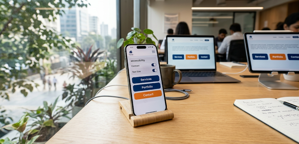
Mobile accessibility is an essential part of website development. Visitors may use smartphones and tablets with different screen sizes, operating systems, zoom settings, and assistive technologies.
A website that works properly on a desktop may still create difficulties on mobile devices if buttons are too small, menus are complicated, or content overflows the screen.
Mobile accessibility improvements
- Use responsive layouts: Make sure website sections adjust to different screen sizes.
- Provide comfortable touch targets: Buttons and interactive controls should be large enough to operate accurately.
- Maintain sufficient spacing: Avoid placing important controls too close together.
- Prevent horizontal scrolling: Ensure ordinary page content fits within the available screen width, except where two-dimensional scrolling is essential.
- Support text resizing: Layouts should remain functional when users increase text size.
- Keep menus simple: Make navigation easy to understand and operate on smaller screens.
- Use accessible mobile dialogs: Ensure popups and overlays can be opened, navigated, and closed properly.
- Test orientation changes: Check whether the website remains usable in portrait and landscape orientations.
WCAG 2.2 includes requirements related to minimum target size, with defined exceptions. Reviewing these criteria can help developers avoid small and difficult-to-use controls.
Test on actual devices
Do not depend entirely on a desktop preview. Open your website on different smartphones and tablets and test navigation, buttons, forms, text resizing, and interactive elements.
Mobile accessibility should be checked throughout the design process, not only after the website is completed.
8. Make Videos, Audio, and Multimedia Content Accessible
Multimedia content can help businesses explain products, demonstrate services, share interviews, and communicate important information. However, not every visitor can access audio or visual information in the same way.
Providing alternatives makes multimedia content easier to understand and use.
Accessibility improvements for multimedia
- Add captions to videos: Captions should include relevant spoken dialogue and meaningful audio information.
- Provide transcripts: Text transcripts allow visitors to read the content of audio and video recordings.
- Include audio descriptions when needed: Important visual information may need to be described for people who cannot see the video.
- Use accessible media controls: Play, pause, volume, and caption controls should be understandable and keyboard accessible.
- Avoid automatic playback: Unexpected audio can disrupt visitors and create difficulties for some users.
- Do not rely on sound alone: Provide visual or text alternatives for important audio notifications.
- Avoid flashing content: Rapid flashing can create risks for people with photosensitive conditions.
For example, a business publishing a product demonstration video should provide accurate captions and make sure important product details are also available in written content.
If a video contains essential visual instructions, captions alone may not be sufficient. An audio description or equivalent text explanation may also be needed.
Accessible multimedia makes business information available through more than one method.
9. Design Clear Content Structure and Understandable Website Language
Website accessibility is not only about visual design or technical code. The way information is written and organized also affects whether visitors can understand it.
Long paragraphs, unclear headings, complicated instructions, and confusing navigation labels can make content difficult to follow.
A well-structured website helps visitors identify important information and move through pages more confidently.
Content accessibility best practices
- Use descriptive headings: Make headings explain what each section contains.
- Organize content logically: Arrange information in a sequence that is easy to follow.
- Write clear sentences: Prefer direct language over unnecessarily complicated expressions.
- Break up long paragraphs: Use shorter paragraphs and relevant subheadings.
- Explain technical terms: Introduce unfamiliar terminology when it is necessary.
- Use descriptive link text: Replace vague labels such as “Click Here” with meaningful descriptions.
- Structure lists properly: Use actual ordered and unordered lists rather than manually typed symbols.
- Provide clear instructions: Explain what visitors should do when completing a task.
Example of clearer website language
Instead of writing:
“Kindly proceed with the aforementioned procedure to facilitate the successful completion of your request.”
Use:
“Follow these steps to submit your request.”
Simple language helps more visitors understand website content, including people who are reading in a second language or using assistive technologies.
10. Improve Accessibility in WordPress and Elementor Websites
WordPress provides a flexible platform for building business websites, but accessibility depends on how the theme, plugins, page layouts, and content are implemented.
A theme may provide useful accessibility features, but this does not automatically make every page accessible. Custom layouts, third-party widgets, animations, and interactive elements still need to be tested.
WordPress accessibility improvements
- Choose a suitable theme: Review theme accessibility features, documentation, and update history.
- Use semantic page structure: Organize content using appropriate headings, navigation, main content, and footer elements.
- Check plugin accessibility: Review forms, sliders, popups, menus, and other plugin-generated components.
- Use accessible images: Add meaningful alternative text where appropriate.
- Review color contrast: Check text, buttons, links, and form fields against their backgrounds.
- Test keyboard functionality: Ensure menus, dialogs, and interactive elements can be operated without a mouse.
- Avoid inaccessible widgets: Replace components that create persistent keyboard or screen-reader barriers.
- Maintain accessible content: Check new pages, blog posts, and media before publishing.
Elementor-specific considerations
Elementor can help website owners build visual page layouts, but accessibility needs to be considered when using its widgets and custom styling.
Pay attention to:
- Correct heading levels in Heading widgets.
- Descriptive link and button labels.
- Accessible navigation menus.
- Properly labelled form fields.
- Meaningful image alternative text.
- Visible keyboard focus states.
- Dialog and popup behavior.
- Responsive layouts and text resizing.
If you are selecting or changing a theme, read our guide on how to choose the best WordPress theme for your business website.
Conclusion: Make Website Accessibility a Priority in 2027
Improving Website Accessibility is an important step toward creating a more inclusive, usable, and professional online experience. Businesses should consider accessibility when designing layouts, writing content, selecting WordPress themes, developing forms, and introducing interactive website features.
Start with practical improvements such as readable typography, sufficient color contrast, meaningful image descriptions, keyboard-friendly navigation, accessible forms, and mobile-friendly layouts. Then evaluate the website using recognized guidelines, automated tools, manual testing, and user feedback.
WCAG 2.2 provides an established framework for identifying and addressing many common accessibility barriers. Businesses should also monitor relevant legal requirements and follow developments in accessibility standards as they evolve.
Remember that accessibility is not simply a technical checklist. It is about making sure visitors can access information, understand your services, and complete important actions without unnecessary obstacles.
By making accessibility an ongoing part of your website strategy, you can create a better experience for more visitors and build a stronger digital presence in 2027.
