
Before choosing colours or creating logo concepts, a business should understand what it wants its brand to communicate. Without this foundation, design decisions can become based entirely on personal preferences or short-term trends.
Brand strategy provides direction for the visual identity. It clarifies the audience, market position, business values, and qualities that should distinguish the company.
Start by answering these questions:
-
Who are your customers? Identify the audience’s needs, expectations, preferences, and buying considerations.
-
What does your business offer? Explain the main products or services and the problems they help customers solve.
-
What makes your business different? Consider expertise, service quality, product design, specialization, convenience, or another genuine advantage.
-
What personality should the brand communicate? Decide whether it should feel modern, approachable, premium, creative, reliable, or technically advanced.
-
What should customers remember? Define the central impression you want people to associate with the business.
For example, a corporate IT consultancy may want to communicate reliability, technical expertise, and clarity. Its visual identity could use structured layouts, restrained colours, and readable typography. A creative art supply store may prefer a more expressive approach that communicates imagination and accessibility.
Neither style is automatically better. The right choice depends on the brand’s audience, positioning, and business objectives.
For Mumbai businesses serving different customer groups, it is also useful to consider the intended market. A local retail business, a B2B manufacturer, and a premium lifestyle brand may need different messaging even if they operate in the same city.
A clearly defined strategy makes it easier to evaluate design concepts against business needs instead of selecting a design simply because it looks attractive.
4. Create a Professional Logo That Represents Your Business
The logo is often the most recognizable element of a brand identity, but effective logo design requires more than a decorative symbol or stylish font. It should be distinctive, appropriate for the business, and practical to use across different sizes and applications.
A logo may appear on a website header, social media profile, product label, invoice, presentation, storefront, or mobile screen. It should remain recognizable and functional in these different settings.


Common logo approaches include:
- Wordmark: Uses the business name as the primary visual element.
- Lettermark: Uses initials or an abbreviation to create a compact identity.
- Symbol or icon: Uses a visual mark associated with the business.
- Combination mark: Brings together a symbol and the business name.
- Emblem: Places the name or symbol within a badge, seal, or enclosed shape.
The appropriate style depends on the business name, industry, intended applications, and identity strategy.
Prioritize simplicity and versatility
An effective logo should not rely on excessive detail to communicate its identity. Intricate elements may become difficult to recognize when the logo is reduced to a small size.
A practical logo system should include suitable variations, such as a primary logo, a compact or stacked version, and a symbol-only version where appropriate. Light and dark versions may also be needed for different backgrounds.
Check legibility and originality
The business name should remain readable, and the design should be distinguishable from competitors. Before finalizing a logo, businesses should review similar marks and consider relevant trademark searches or professional advice where necessary.
A professional logo designer should also provide appropriate file formats, including vector artwork for scalable use and web-ready files for digital applications.
Typography influences the visual character and readability of brand communication. The fonts used in a logo, website headings, paragraphs, brochures, and advertisements should work together to create a consistent experience.
A business does not need many fonts to establish a distinctive identity. In many cases, a carefully selected heading font and body font are enough, supported by a clear hierarchy of sizes and weights.
Establish a typography system
A practical typography system defines how text should appear in different contexts:
-
Headings: Create hierarchy and draw attention to important messages.
-
Body text: Make detailed information comfortable to read.
-
Buttons and labels: Keep actions and short interface messages clear.
-
Supporting text: Present captions, disclaimers, and secondary information without competing with primary content.
Match typography to your brand personality
A premium hospitality brand may use refined serif typography for selected headings, paired with a highly readable body font. A technology business might prefer a modern sans-serif system, while an artistic brand could use more expressive typography in limited applications.
The key is balance. Highly decorative fonts may work for a short headline but become difficult to read in long paragraphs or small mobile layouts.
Maintain consistency across platforms
Typography should be tested on desktop and mobile screens, and font choices should be reviewed for language support, licensing, loading performance, and availability across the required applications.
For websites, establish consistent font sizes, line spacing, heading styles, and text colours. For printed materials, confirm that fonts display correctly in the final production files.
When typography is defined clearly, the brand feels more coordinated and content becomes easier to scan and understand.
7. Develop a Consistent Visual Language
Once the logo, colours, and typography are established, the next step is to define the supporting visual elements that make the brand recognizable. These elements create continuity across marketing materials without requiring every design to look identical.
A consistent visual language includes the style of photographs, illustrations, icons, graphic shapes, patterns, borders, layouts, and other design details.
For example, a premium real estate company may use architectural photography, spacious layouts, subtle graphic lines, and restrained colour combinations. A creative retail business may use brighter imagery, playful graphic elements, and more dynamic compositions.
The goal is to develop a visual style that reflects the brand’s personality while allowing flexibility for different types of content.
Elements to define
-
Photography style: Specify lighting, composition, subject selection, and image treatment.
-
Iconography: Use a consistent icon style rather than mixing unrelated outline and filled icons.
-
Graphic elements: Define suitable patterns, shapes, borders, and decorative accents.
-
Layout principles: Establish guidelines for spacing, alignment, image placement, and visual hierarchy.
-
Image treatment: Decide whether photographs should be bright, natural, editorial, minimal, or otherwise consistent with the brand.
Businesses should also avoid using stock images that feel unrelated to their actual services. Original photography, when practical, can help communicate genuine products, people, locations, and completed projects.
A well-defined visual language makes it easier for designers to produce new materials while preserving the character of the business.
8. Apply Your Brand Identity Consistently Across Your Website
A business website is often one of the most important places where customers evaluate a brand. It should communicate the company’s identity from the first screen through the service pages, contact section, and other important interactions.
A well-designed logo cannot create a consistent brand experience if the rest of the website uses unrelated colours, typography, imagery, and layouts.
Website design should translate the brand guidelines into a functional digital experience.
Important website elements
-
Header and navigation: Use consistent logo placement, typography, colours, and spacing.
-
Homepage: Communicate the brand’s purpose, key offerings, and distinctive value clearly.
-
Service and product pages: Maintain consistent layouts, imagery, headings, and calls to action.
-
Buttons and forms: Use repeatable styles for buttons, form fields, and interactive elements.
-
Footer: Keep contact information, navigation, social links, and visual styling aligned with the rest of the website.
-
Mobile experience: Ensure the identity remains clear and usable on smaller screens.
For businesses using WordPress and Elementor, global fonts, global colours, reusable templates, and consistent button styles can help maintain the same visual system across multiple pages.
However, consistency should not come at the expense of usability. Text must remain readable, navigation must be understandable, and important actions should be easy to find. The design should also support responsive layouts, suitable loading performance, and accessibility.
A strong website identity combines visual consistency with a clear user journey, helping visitors understand the business and decide what to do next.
9. Maintain Brand Consistency Across Social Media and Marketing Materials
Customers may interact with a business through several marketing channels before contacting it. A consistent brand identity helps connect these interactions, even when the content and format change.
Social media posts, advertisements, email campaigns, brochures, presentations, and promotional banners should all reflect the same underlying visual direction.
This does not mean every post needs the same layout. Rather, the designs should share recognizable characteristics such as colours, typography, image treatment, logo placement, and tone of communication.

Create reusable marketing templates
- Instagram posts, stories, and promotional creatives.
- Facebook and LinkedIn graphics.
- Digital advertising banners and campaign visuals.
- Email newsletters and promotional announcements.
- Business presentations and company profiles.
- Brochures, flyers, and event materials.
Templates are particularly useful when multiple employees, designers, or marketing partners create content for the same business. They reduce unnecessary variation and make it easier to maintain quality.
Adapt content without losing identity
Each platform has its own dimensions, audience expectations, and content formats. A design created for a website banner may not work directly as a square social media post. The layout may need to change, but the brand’s visual language should remain recognizable.
For example, an ecommerce company can use different creative formats for product launches, festive campaigns, and educational content while retaining its core typography, colours, and photography style.
Businesses should review their social profiles and existing marketing materials periodically to identify outdated logos, inconsistent colours, low-quality visuals, or messaging that no longer reflects the brand.
10. Develop Brand Guidelines for Long-Term Consistency
Brand guidelines document how a brand identity should be used. They help ensure that employees, designers, developers, printers, and external marketing partners follow the same standards when producing new materials.
Without guidelines, a business may gradually accumulate different logo versions, inconsistent colour choices, unrelated fonts, and conflicting visual styles. This can happen even when the original identity is professionally designed.
A brand guideline document provides a common reference for everyone working with the brand.
What should brand guidelines include?
A useful document may contain:
-
Brand overview: The business purpose, positioning, values, and personality.
-
Logo usage: Approved logo versions, clear space, minimum sizes, and incorrect usage examples.
-
Colour specifications: Primary, secondary, accent, and neutral colours with relevant digital and print values.
-
Typography rules: Approved font families, weights, sizes, and hierarchy.
-
Imagery guidelines: Photography style, illustration approach, and image selection principles.
-
Graphic elements: Rules for icons, patterns, shapes, and supporting visuals.
-
Digital applications: Guidance for websites, social media, email, and online advertising.
-
Print applications: Standards for business cards, stationery, brochures, and packaging.
-
Tone of voice: Guidance on how the business communicates with its audience.
-
File management: Information about approved assets and where teams can access them.
The level of detail should suit the size and complexity of the business. A small local business may need a concise guide, while a company operating across multiple departments or locations may require a more comprehensive document.
Guidelines should also be practical to use. If employees cannot easily find approved assets or understand the rules, consistency becomes harder to maintain.
11. Common Brand Identity Design Mistakes Businesses Should Avoid
A brand identity can lose effectiveness when its elements are selected without a clear strategy or applied inconsistently. Businesses can avoid many common problems by evaluating their identity as a complete system rather than focusing only on the logo.
Designing around trends instead of business needs
Design trends change over time. A brand built entirely around a temporary visual trend may need frequent revisions. Businesses should prioritize relevance, clarity, and usability while using trends selectively where they support the brand.
Using too many colours and fonts
An uncontrolled mix of colours, typefaces, and graphic styles can make a business appear inconsistent. A defined visual system provides enough flexibility without introducing unnecessary variation.
Copying competitor identities
Competitor research can help identify industry conventions, but copying another company’s logo, colours, or visual approach can make a business less distinctive. The aim should be to understand the market and develop an identity that communicates the company’s own positioning.
Ignoring small-screen applications
A logo or graphic that looks good on a large monitor may become unreadable on a mobile screen or social profile. Important identity elements should be tested at realistic sizes.
Using inconsistent brand assets
Old logos, different colour values, unapproved fonts, and low-resolution images can weaken the overall presentation. Keep approved assets organized and make the current versions easy to access.
Treating the website and marketing as separate brands
When the website looks formal but social media graphics use an unrelated style, customers may experience a disconnect. Both should follow the same brand guidelines while adapting to the requirements of each platform.
Failing to review the identity over time
A business may expand into new markets, introduce services, or change its positioning. Its identity should be reviewed periodically to determine whether it still represents the company accurately.
The objective is not to redesign everything frequently. It is to preserve consistency while making thoughtful improvements when business needs genuinely change.
12. How to Choose the Right Brand Identity Design Agency
Developing a complete brand identity requires strategic thinking, visual design skills, and an understanding of how the identity will be used in real business situations. Choosing the right design partner can help ensure that the final work is practical as well as visually appealing.
Businesses should evaluate an agency’s approach, portfolio, communication, and ability to deliver the assets required for their operations.
Evaluate the portfolio and design process
Review previous projects to understand the agency’s design quality, range, and consistency. Look for examples where the logo, colours, typography, website, and supporting materials work together rather than isolated logo samples alone.
Ask how the agency approaches research, discovery, concept development, feedback, and final delivery. A clear process helps set expectations and reduces confusion during the project.
Confirm the deliverables
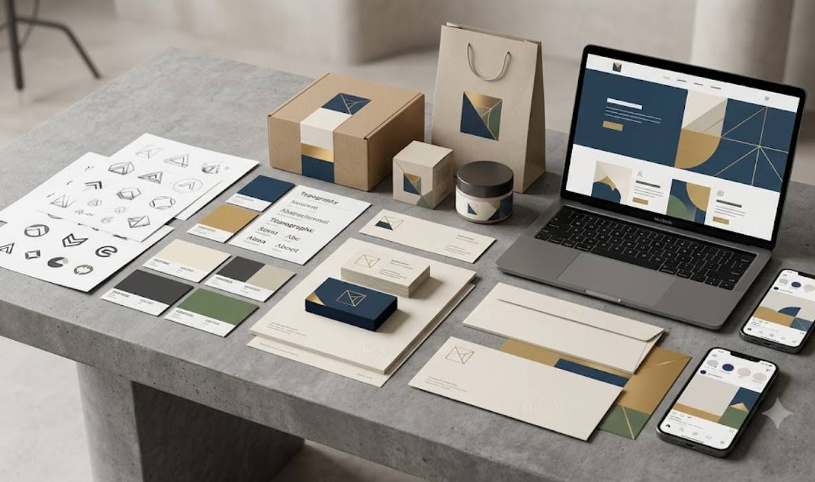
Before starting, clarify exactly what the project includes. Depending on the business’s requirements, deliverables may include:
-
Logo concepts and approved logo variations.
-
Colour palette and typography system.
-
Brand identity presentation and usage guidelines.
-
Business card and stationery designs.
-
Social media and advertising templates.
-
Website visual direction or website design.
-
Exported digital assets and scalable vector files.
Not every project requires every item. The scope should reflect the business’s needs, budget, and future plans.
Discuss collaboration and timelines
A good working relationship depends on clear communication, reasonable milestones, and a shared understanding of the project objectives. Ask how feedback will be handled, how many revision rounds are included, and who will approve the final designs.
Also confirm the rights and usage terms for the final assets, any font or stock-image licences, and whether editable source files are included.
Consider the complete customer experience
If the business needs a logo, website, and marketing materials, it can be useful to work with a partner who understands how these elements connect. This can help create a more coherent brand experience from discovery through customer enquiry.
For businesses in Mumbai, The Web Decor can be considered as a potential partner for branding and related website and digital design requirements. Evaluate the actual project scope, relevant portfolio examples, deliverables, and terms before making a decision.
Conclusion
Brand identity design is an investment in how a business presents itself and communicates with its audience. From the logo and colour palette to website design, social media, and printed materials, each element contributes to the overall impression customers receive.
The strongest identities begin with a clear understanding of the business, its audience, and its positioning. They translate that understanding into a practical visual system and maintain consistency across the places where customers interact with the brand.
For businesses in Mumbai, a well-planned identity can provide a stronger foundation for marketing, customer communication, and future growth. The key is to create a system that is distinctive, usable, and appropriate for the business—not simply a logo that looks attractive in isolation.
The Web Decor can be considered for branding, website design, and related digital requirements. Start by identifying what your business needs, then build an identity that connects your visual presentation with the experience you want customers to receive.

