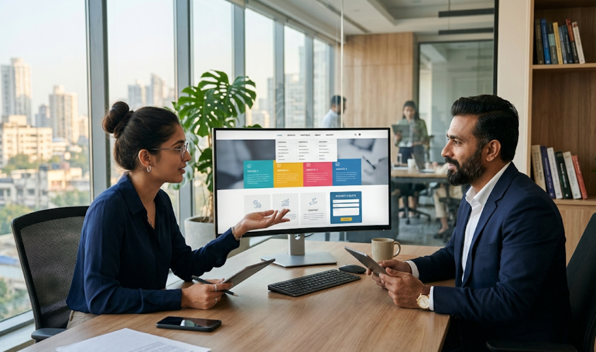

A website can have an attractive design, valuable content, and excellent services, but visitors may still leave if they cannot find the information they need. Website navigation plays an important role in connecting visitors with different pages, products, services, and resources. For business websites, a clear navigation structure can improve usability, encourage visitors to explore more pages, and make it easier for potential customers to take action.
WordPress website navigation should be designed around the needs of visitors rather than simply displaying every available page in the main menu. A well-organised navigation system helps users understand where they are, where they can go next, and how to find relevant information without unnecessary effort.
Whether you operate a business website, an eCommerce store, a professional portfolio, or a service-based website, improving navigation can create a smoother browsing experience. WordPress provides several ways to customise menus, organise pages, create dropdowns, add mobile navigation, and improve the overall structure of a website.
In this guide, we will explore practical ways to improve WordPress website navigation for a better user experience, including menu organisation, mobile usability, internal linking, accessibility, and performance considerations.
1. Understand Why Website Navigation Matters
Website navigation is the system that allows visitors to move between different pages and sections of a website. It includes the main menu, dropdown menus, footer links, breadcrumbs, internal links, and other navigation elements.
When visitors arrive on a website, they usually have a specific goal. They may want to learn about a service, compare products, read a blog article, contact a business, or complete a purchase. If the navigation is confusing, they may struggle to reach the information they need.
A well-planned navigation structure makes browsing more predictable and comfortable. It also helps visitors understand how the website is organised.
For business owners, better navigation can support several important website goals:
- Improved user experience: Visitors can find relevant information without unnecessary clicks.
- Better engagement: Clear navigation encourages users to explore additional pages.
- Stronger conversions: Visitors can reach service pages, product pages, and enquiry forms more easily.
- Reduced frustration: Organised menus prevent users from feeling lost while browsing.
- Better content discovery: Important resources and articles become easier to access.
- Clearer website structure: Search engines can better understand relationships between pages when the website uses logical internal linking.
Navigation should not be treated as a decorative design element. It is an essential part of website usability and should be planned during website development.
2. Create a Simple and Logical Main Menu
The main navigation menu is usually one of the first elements visitors notice. It typically appears in the website header and provides access to the most important pages.
A common mistake is adding too many links to the main menu. Business owners sometimes include every page, service, category, and resource, making the header difficult to understand. A crowded menu can overwhelm visitors, especially when they are browsing on smaller screens.
Instead, prioritise the pages that visitors are most likely to need.
For example, a professional business website may use the following structure:
- Home
- About Us
- Services
- Portfolio
- Blog
- Contact Us
The exact menu will depend on the business model, website size, and audience requirements.
Follow these practical guidelines when creating your main menu:
- Prioritise important pages: Give greater visibility to services, products, and contact information.
- Use familiar labels: Choose simple names such as About, Services, Products, and Contact.
- Maintain a logical order: Arrange menu items according to the typical visitor journey.
- Avoid unnecessary links: Move less important pages to the footer or relevant submenus.
- Keep labels concise: Short menu names are easier to scan and understand.
- Highlight key actions: Use a clearly styled button for actions such as Get a Quote or Book a Consultation when appropriate.
A simple navigation menu helps visitors understand the website immediately. It also creates a more organised appearance across desktop and mobile devices.
3. Organise Pages Using Clear Categories and Dropdown Menus
As a WordPress website grows, the number of pages and services may increase. Displaying all these pages directly in the main menu can create unnecessary clutter.
Dropdown menus help organise related pages under broader categories. They allow visitors to explore specific options without making the primary navigation too complicated.
For example, a website development company may organise its Services menu like this:
- Website Development
- WordPress Development
- eCommerce Development
- Custom Website Development
- Website Redesign
- Digital Marketing
- Search Engine Optimisation
- Social Media Marketing
- Content Marketing
This structure helps visitors understand the relationship between different services.
However, dropdown menus should be designed carefully. Deeply nested menus can become difficult to use, particularly on mobile devices and for visitors using keyboards or assistive technology.
Consider these recommendations:
- Group related pages under meaningful parent categories.
- Avoid creating too many dropdown levels.
- Use clear labels that describe the content inside each submenu.
- Ensure dropdown menus have enough spacing between links.
- Make dropdowns usable with both mouse and keyboard interactions.
- Test dropdown behaviour on touchscreens.
- Keep the most important links visible without requiring multiple interactions.
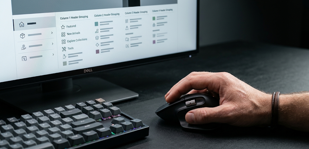
For larger websites, a mega menu may be useful. It can display multiple related categories in a structured layout. However, mega menus should only be used when they genuinely improve content discovery.
4. Make WordPress Website Navigation Mobile-Friendly
Mobile-friendly navigation is essential because many visitors access business websites through smartphones and tablets. A menu that works perfectly on a desktop may become difficult to use on a smaller screen.
On mobile devices, navigation menus often use a hamburger icon that opens a collapsible menu. This approach saves screen space while allowing visitors to access important pages.
However, simply adding a hamburger icon does not guarantee a good mobile experience. The menu should be easy to open, understand, scroll through, and close.
Important mobile navigation improvements include:
- Use an easy-to-tap menu button: Provide enough space around the hamburger icon.
- Keep links comfortably sized: Avoid placing menu items too close together.
- Use readable typography: Choose font sizes that remain clear on smaller displays.
- Prevent horizontal scrolling: Make sure menu content fits within the viewport.
- Make dropdowns touch-friendly: Visitors should be able to expand categories without accidental clicks.
- Keep the menu accessible: Support keyboard navigation and meaningful accessible labels.
- Show important actions: Keep contact, enquiry, or shopping options easy to find.
Test the navigation on different screen sizes instead of relying only on the desktop preview. Check how it behaves on common smartphone widths, tablets, and landscape orientations.
A responsive menu should feel natural on every device, not like a compressed version of the desktop menu.
5. Use Clear Navigation Labels and Consistent Language
Navigation labels should communicate exactly what visitors can expect after clicking them. Unclear or creative wording may look visually interesting, but it can make the website harder to use.
For example, a business website may use a label such as “What We Do” instead of “Services”. While both can communicate a similar idea, “Services” is generally more immediately recognisable.
The objective is to reduce uncertainty. Visitors should not have to guess what a menu item means.
Use these principles when writing navigation labels:
- Choose familiar terminology: Use words that visitors already understand.
- Be specific: Prefer Services over a vague label such as Explore.
- Maintain consistency: Use similar wording across menus, buttons, and page headings.
- Avoid unnecessary abbreviations: Spell out labels unless the abbreviation is widely recognised.
- Keep labels short: Long navigation names can create layout problems.
- Match visitor expectations: Use Products for product listings and Contact for enquiry information.
Consistency is equally important. If the header uses “Our Services”, the footer should not unexpectedly use “What We Offer” for the same destination unless there is a clear reason.
Clear labels help visitors navigate confidently and make the overall website experience more predictable.
6. Add Breadcrumb Navigation to Improve Page Orientation
Breadcrumb navigation shows visitors where they are within a website’s structure. It usually appears near the top of a page and displays a path from the homepage to the current page.
For example:
Home → Services → Website Development → WordPress Development
Breadcrumbs are particularly useful for websites with many pages, service categories, product collections, or blog archives.
They help visitors understand the relationship between the current page and its parent categories. They also provide convenient links to previously visited levels without requiring users to return to the main menu.
Breadcrumb navigation can be beneficial for:
- Large corporate websites with multiple service categories.
- eCommerce stores with product categories and subcategories.
- Educational websites with courses and subject pages.
- Blogs with several content categories.
- Websites with deep page hierarchies.
When implementing breadcrumbs, keep the design simple and consistent. Place them in a predictable location, use readable separators, and make sure linked items are easy to identify.
WordPress users can implement breadcrumbs through suitable SEO plugins, dedicated breadcrumb plugins, or theme functionality. Some page builders and themes also provide built-in breadcrumb widgets.
Remember that breadcrumbs should reflect the actual website hierarchy. Avoid displaying confusing or inaccurate paths just to add another navigation element.
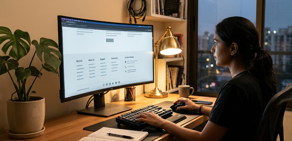
7. Improve Footer Navigation and Secondary Links
The footer is an important navigation area that visitors often use when they reach the bottom of a page or need additional website information.
While the header should contain the most important navigation links, the footer can provide access to secondary pages, business information, policies, and useful resources.
A well-organised footer may include:
- Company information: About Us, Our Team, and Company Profile.
- Service links: Important service pages and relevant subcategories.
- Useful resources: Blog, Case Studies, Guides, and Downloads.
- Customer support: Contact Us, Help Centre, and Support.
- Legal information: Privacy Policy, Terms and Conditions, and Cookie Policy.
- Business details: Address, email, phone number, and social media links.
For an eCommerce website, the footer may also include shipping information, returns, payment methods, and order-related support pages.
Avoid placing every website link in the footer. Too many links can make it difficult to scan and may reduce the usefulness of the section.